14 Jul Smart Ways to Design Business Cards That Reflect Your Brand.
Your business cards in traditional print or digital format can speak before you do!
In this hyper-digital world, where LinkedIn connections and QR codes dominate networking, it is easy to assume business cards are outdated. But here’s the truth: that small piece of cardstock still carries major weight and people are paying attention.
Studies suggest that a shocking 72% of people judge a person or company based on the quality of their business cards. First impressions really do matter. But how do you design a business card that shares your contact details but also reflects the identity and values of your brand. The answer lies in smart and strategic design choices that align with your brand.
This blog will cover interesting ways to create business cards that get noticed and remembered.
Why First Impressions Matter in Business Card Design
A business card is far more than a slip of paper with your contact details. It is a handshake, an introduction, and a silent brand ambassador all in one. A thoughtfully designed card can communicate your business values and professionalism in your work.
Think of it this way: while your digital presence works around the clock, your business card can be an offline representative for your brand. It makes a strong first impression and leaves a memorable one long after the conversation ends.
That is why learning smart business card design is not just aesthetic but strategic. The right approach can make this small space a powerful opportunity to express your brand identity. You can approach Name card printing services for the best assistance.
Business Card Design Tips That Make You Stand Out
Focus on Clean Layout and Readable Fonts
Keep your business cards clear and avoid adding irrelevant content or information design. Make your layout simple, and watch the white spaces you employ. White spaces can balance things while bringing focus to your main message. If you’re able to design it cleanly, wonderful!
The choice of font is crucial to make it look professional and clean. Check for readable fonts like sans-serif and Helvetica. These can add a clean and modern touch, without compromising on readability. A properly organized card with a minimalist look will convey a sense of purpose of your business.
Choose a Color Pattern That Shows Brand Consistency
Colors can add emotion and reinforce the identity of your brand. You must think about what your brand colors communicate – like blue often conveys trust and red shows energy. These color associations make it important for you to choose accordingly.
You must ensure that the colors on your card align with your branding strategies. Your website and other marketing materials must have a consistent color pattern. A balanced and harmonious color scheme catches attention and builds trust through visual consistency and professionalism.
Preferably, add your Logo and Taglines into the Strategy
Your logo serves as the face of your brand; therefore, it should be the first thing to appear, but not so prominently that it obscures the rest. Place it in a position where the eye will follow, not incorrectly, but usually it is at the top-left or the centre of the card.
The tagline (if you use one) should complement the logo, providing an immediate introduction to what you do or what you believe in. This verbal and visual combination makes your brand message hard to crack.
Keep the Contact Details Clear
Vital information to include is the name, phone number, email, site, and possibly an address. Legibility should be put at the forefront; legibility matters, as small, crowded text is more counterproductive than helpful.
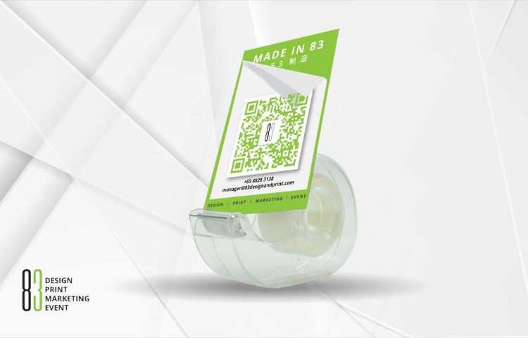
Images can make it easier to simplify the appearance (such as a small envelope by email), and you may incorporate QR codes that redirect individuals to a portfolio or LinkedIn profile, allowing them to delve into more detail.
You Can Experiment with Unique Forms
Would you like to stick in people’s minds? There is no need to be afraid of shaking the rectangular mold. They can stand out around corners, on square cards, or in vertical orientation. You must ensure that it has the right shape to accommodate wallets or cardholders, to be visible rather than hidden underneath.
Use Only Top Quality Materials
People relate professionalism to tactile quality. Use thick card material like matte or textured paper. Some might ignore these facts, but these things contribute importantly to the perception of an increase in value.
A luxury card indicates to others that your brand is not cheap, and this is what customers always want to know.
Add Special Finish and Touch
You can instantly make your card feel and look premium with embossed text or spot UV coating. These improvements can be attractive and be a point of quality and refinement. Special finishes can add an eye-catching effect and feel appealing to ensure your card does not end up in the recycling bin.
Include a Relevant Call-to-Action
Your business card should include an invitation to action along with your contact details. This encourages recipients to follow up after they get your card. If it is visiting your website or scheduling a consultation, a CTA brings engagement. Make it simple and relevant to your brand and turn a passive exchange into an active opportunity for lasting relationships.
What to Avoid in Business Card Design
Overdesigning: It includes too many things, colors, or fonts and leads to confusion instead of a positive impression.
- Small fonts: If someone needs to magnify the information, then it is a failure.
- Poor material: Cheap quality cards convey a wrong impression about your business standards.
- Old contact details: You must check your email, phone number, and web addresses before printing.
- Low-quality print: Fuzzy logos with sloppy borders show unprofessionalism in your business.
All these design mistakes can take away the credibility and influence of your brand.
Final Thoughts
A perfectly designed business card can be more than a contact tool. It is a tangible reflection of the identity of your brand. The right business card design strategy and professional assistance can spark conversations and leave lasting impressions.
These design tips are not just about aesthetics, but they are about communicating who you are – clearly and confidently.
Ready to elevate your brand’s first impression?
Partner with 83 DPME (Design.Print.Marketing.Event & Exhibition) to create business cards that truly represent your vision.
No Comments